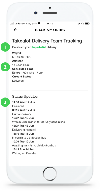
Profile redesign on apps
Problem: The profile section used webview, while reworking it we also redesigned profile to accommodate all user tasks, for scaling and improving usability.
Goal: Improve information architecture, usability, findability and set the section up for scaling.
Privacy & detail
It's really gratifying to share my experiences while designing in these case studies.
I love my job.
As a human centred designer it is important that I protect the privacy of the people I work with. I also have a responsibility to keep the competitive details — competitive.
Any lack of detail in the solution are due to these reasons and not in the quality of the work.
Project status

Expert review
- Platform specific components are missing and sometimes seem to be mis-interpreted
- Our implementation can support the (platform) design guidelines better
- We should focus on scale, all decisions and build elements should support our long-term UX design goal
- Personalisation is a theme in other planned projects - the structure should cater for that
- Customer communication channels should be human centred not use business speak
UX writing, UX strategy, Information architecture, Interaction model and task analysis does not seem to be a strong technical competency. They all need attention. UX writing needs to be reworked. The content ranges from passive aggressive to filler copy
- There does not seem to be an UX strategy or design persona and there aren’t any design principles governing decisions
- Empty and nudge states are not utilised
- Event driven activities are treated like static tasks
- Prioritised actions look like they were tacked on
Assessment
- If we see this section as a Profile the conceptual model makes betters sense
- The profile becomes the hub page where all information relating to the customer and their preferred interaction with Superbalist live
- Settings - document how software or technology should behave - in this case it can live under the Profile section if needed
- Tasks are grouped better and the information architecture architecture is more elegant
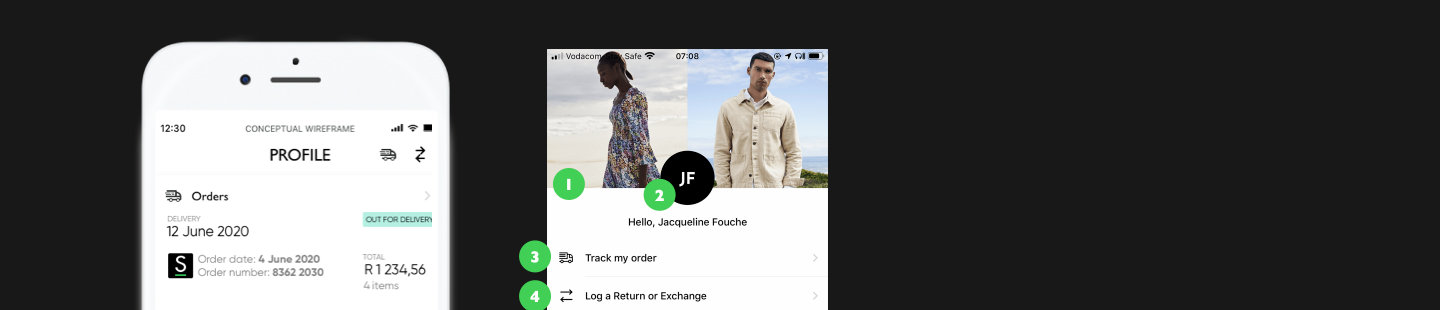
1. The title behaves differently than the rest of the app. If the photographs are a spotlight it should snap to a title bar
2. Title vs sentence case confusion
If this is a profile - what type of personalisation or photography should we show? I think a curated brand image is more on point. Profile pictures are important on apps and systems where other people identify you.
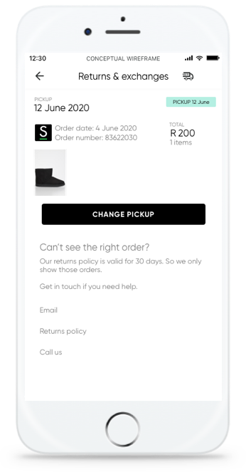
3. Track my order is a conditional navigation item. Should it be there all the time?
4. Log a return seems to be the second most important action on the section. Should it be part of a spotlight or toolbar?
5. Account chevron should show down and up. This sub-categorisation hides important information at the expense if unimportant information. It also complicates the UI. Just show the navigation instead. This entire section is the profile. The other elements belong to that category.
6. Why use arbitrary time delineation as part of the Information architecture? Orders and Returns are objects with data. Active orders should display in the hub page
7. Where is the rest of the payment information?
This, as most other pages, have a great information and visual design.
We should explore enhancements for the page specifically the micro information for the order may be improved slightly. The other opportunity lies with responsive content using time-based triggers.
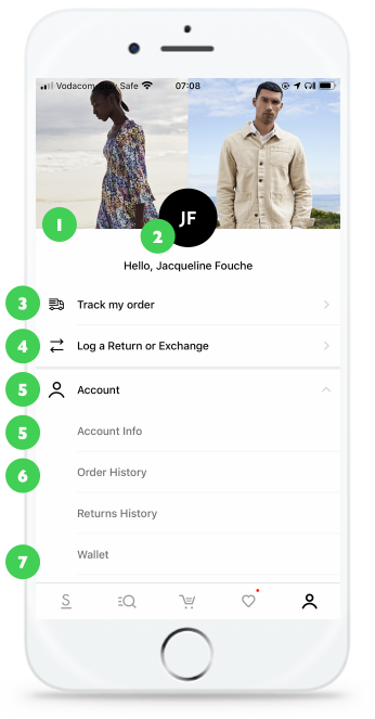
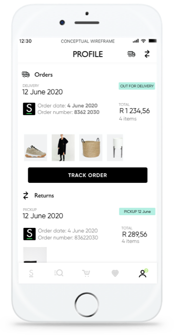
Why are we talking about tracking an order if it was already delivered? This entire page is an old order. This is an example of using a time based trigger as a destination.
1. The page title is deceptive. It should focus on the delivery status.
2. Nice design. It feels more web than app however.
We’re already on the Order detail page, why are providing filler content?
3. Is Order number really a primary data point for customers to recognise their current order? The items in the order with the total feels more logical for recognition. The delivery date and status is more important from an information need.
4. You’re on the Superbalist app. 2 further data points about brand feels excessive
5. We need better guidance on numbers in the styleguide. There should be a space after currency and after thousands.
6. A red primary call to action feels very difficult to manage from a design communication perspective. There are three variant of primary call to action buttons. Red, green and grey. A primary call to action denotes a single style. We should simplify the design language.
7. The label Delivery 1 has no informational value in this scenario. If it denotes split deliveries it should only display when the delivery is split and not as a default.
8. Why do we contract?
- QTY. We should write out the words unless space is an issue.
- This comes back to the Experience design strategy and design persona. Who are we or who are we trying to emulate? QTY is Pep or Ackermans. EasyJet or RyanAir if we look at other industries.
- Premium brands would enunciate
- Personally I dislike it because it is lazy. It means we got so used to dealing with the backend that we did not consider how we want our customers to feel when they spend money with us
Micro information architecture seems weird.
I understand we may need to have item status on a object level as a default because of the variances. But my feeling is it would be better to show status on an item level when it is needed. E.g. before delivery or when Refund was requested.
My expected order is Product name, Price, Delivery status, Quantity, Size.
This section has fontitis. Bold, Italic, size differences and in different colours.
9. We should improve the copy at a minimum. It would be better to show different status based on time but I understand that may cause strain of the services.
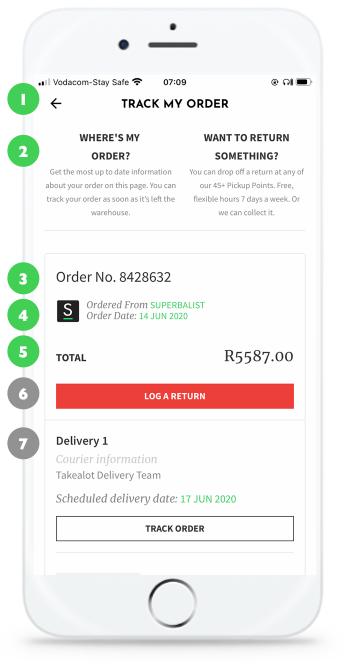
1. Why is Superbalist in green? I know it’s used as an accent but it looks like a tertiary link. Rather use bold, or even better. Why are we mentioning the brand. Rather use the logo mark and restructure the page a bit.
2. Micro information architecture is off. Review order.
3. Layout focuses on date - it actually just feels difficult to read
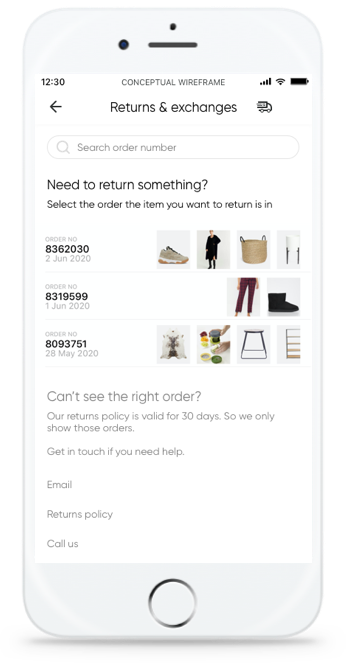
The order overview as images is genius. We should use this pattern wherever we need to show an order overview.
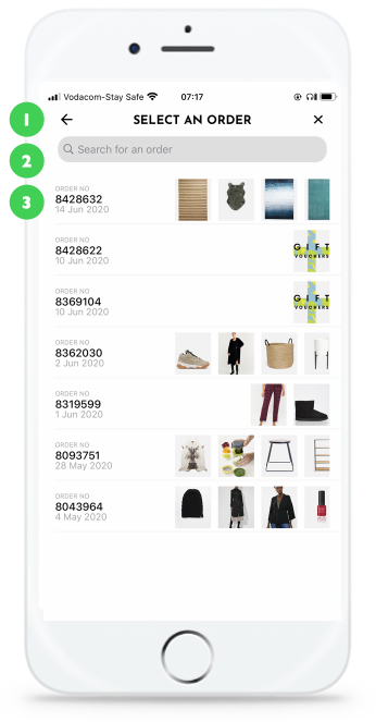
1. Interaction model is really weird. Why is there a back and a close button?
This is another pointer that the information architecture, navigation model, interaction model and conceptual model is slightly misaligned.
It is the type of problem that is difficult to untangle but usually easy to fix after you’ve figured out all the problems.
This problem’s been highlighted with other areas of the site.
2. Search background colour is wrong colour. Too dark.
Can we we specific on what labels search actually allows?
This is a usability issue.
3. Micro information architecture feels a bit off
I’d expect Amount and number of items in an order to be recognition factors for customers.
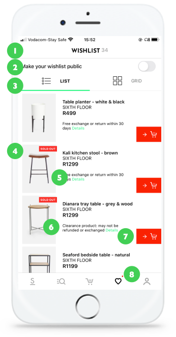
1. I find the superscript difficult to read and interpret. We’ll at it to our research backlog
2. What is the value of a public wishlist? We will kick off a Wishlist research project at some point in the near future
3. The list vs grid is really cool. But should it be a segmented control. Couldn’t we do it as a view option in the title bar?The Wishlist is a very important real estate so we should prioritise and make every element count
4. Over use of badges means important elements no longer have value for recognition. We shouldn’t have more than 3 styles in total. Only 2 should carry meaning the last should hold information.
5. The colour jumps. What does it mean? Is it a link and is that why it is a slightly different green than the highlight colour?
6. Do we really need the content here all the time? Is it a customer data point? We should test it.
7. Cool button. But it is completely different than all the other buttons. From an interaction design perspective I would like to create strong associations with the Cart and Favourite buttons - that means it should always look and behave in the same way. Is it square or round? It should be as distinctive as the logo mark.
8. Why is there a red dot? It usually denotes activity or updates.
Conceptual design
The conceptual design reworked the issues found in the expert review. The best part of the profile redesign was to highlight triggered events. For instance, when you are waiting for a order it should show it to you — that’s the most important thing you want from the app at that time. Bubbling up the most relevant activity should be part of the experience strategy.
Unfortunately this functionality was de-prioritised - I’m hoping I can get this into a sprint soon as I believe it will be massively beneficial to our customers.
Nudge states
The system doesn’t currently help our customers make a decision when they just joined or do something new. With this project we started adding nudge (empty) states as a prelude to doing onboard design patterns.
Work

Malignant design mantrasWhen your favourite heuristic makes your design worse - instead of better
Make friends for moneyA talk on helping designers and engineers work better together. By thinking about money more.
Reductionist wisdomA dissection on what people think about when you show your design solutions to them
Lockdown leadership lessonsMy experiences and some tips on starting a new head of UX role under lockdown.
Set a continuous research programmeDesign leadership

Design processDesign leadership, process

Hiring designersDesign leadership

Go humanI'm looking at how designers can use their skills to help with the planet emergency.

Superfluid experiencesMy Experience design company - I'm working on tools to help designers & small businesses. It should be easy to do things.
POPIConceptual design & leadership
Studio managementService design